The Science of Sticky Apps study guide · Lesson 8 of 11
Design Patterns & Ethics
Core loop & notifications · Social sequencing & onboarding · Ethical design guardrails · People, Places, Things, Events
Unofficial study guide for Hooked: How to Build Habit-Forming Products by Nir Eyal, Ryan Hoover. FlashFeed is not affiliated with the author or publisher.
This is the lesson's study guide from the FlashFeed app, plus its key facts and a self-test.
What you'll be able to do
- Describe the four jobs of a core loop and the Doherty Threshold (sub-400ms feedback that feels instantaneous).
- Identify a state-triggered, personalized notification that references specific user investment.
- Apply progressive disclosure and the zero blank slate, and sequence social mechanics from asynchronous proof to cooperation to synchronous competition.
- Distinguish dark patterns from humane design and apply Fogg's maxims (help people do what they want; simplicity changes behavior).
- Apply the PPTE context framework (People, Places, Things, Events) to locate re-engagement levers.
Core loop & notifications
The core loop is the atomic unit of a sticky app — the repeatable action cycle that every retention mechanic eventually wraps around. Notifications exist to pull users back into it.
The four jobs of a core loop
Every sticky app has a core loop — the action a user repeats each session. A well-designed one satisfies four criteria simultaneously: it completes in 2–5 minutes (fitting a micro-session between meetings or on a commute), it delivers immediate feedback below the Doherty Threshold of 400 ms (the sub-400 ms response time, from Doherty and Thadhani's 1982 IBM research, below which a user and system keep pace with each other and productivity soars), it ends with a variable reward to drive anticipation, and it plants a setup condition for the next session. Strip any one of these and the loop either feels slow, pointless, or terminal.
End on an open loop
The best core loops don't end clean — they end with a Zeigarnik open loop. The Zeigarnik effect — Bluma Zeigarnik's finding that interrupted tasks were better remembered — has proved hard to replicate (a 2025 meta-analysis found no memory advantage), but the closely related Ovsiankina effect, the tendency to resume interrupted tasks, is well supported. App designers exploit this deliberately: an unfinished lesson, a half-built streak, a "come back tomorrow for your result" hook leaves a small cognitive itch the user wants to scratch. The loop never truly closes — it just resets with new stakes.
Notifications: trigger on state, not the clock
Effective notifications are contextually triggered, not time-scheduled. Firing at 9 AM every day regardless of user state is the weakest possible signal — the brain habituates to a predictable signal and starts ignoring it. The pattern that works: fire when the user breaks their streak pattern or crosses a behaviorally meaningful threshold. A personalized notification such as "Your 14-day streak is at risk" outperforms a generic reminder because it references the user's specific investment. Social triggers — "Alex just passed your score" — layer in competitive loss aversion on top. Treating a fixed daily schedule as best practice therefore misses the point.
The streak + freeze pattern
Any app usable daily should have a streak counter — a running tally of consecutive-day sessions that converts a single daily habit into compounding psychological investment. The freeze mechanic extends this without breaking it: a missed day passes without streak loss, via a purchased or earned freeze token. This converts the streak from a fragile anxiety driver into a resource-management meta-game. Users now manage their freeze inventory, not just their calendar — a meaningful decision that deepens engagement beyond the primary content.
Social sequencing & onboarding
Onboarding is the highest-leverage minute in any app's lifecycle — users who don't reach value fast leave permanently. Social mechanics work best when sequenced to match where a user's trust actually sits.
Instrument the Aha Moment
The Aha Moment is the specific action most correlated with 7-day retention in your cohort data — not the action product managers assume is meaningful, but the one analytics surfaces. Onboarding has one job: deliver users to that moment as fast as possible. Everything before it is overhead to be eliminated. Progressive disclosure is the key onboarding principle here: reveal complexity gradually rather than dumping every feature on screen at once. New users lack the context to evaluate features they haven't experienced, so showing them all upfront creates overwhelm, not excitement. A common rule of thumb is to aim for a first quick win within about 60 seconds.
The zero blank slate principle handles the empty-screen problem: pre-populate a new user's experience with suggested friends, example content, or seeded data, because an empty screen signals no value. A social app that shows zero connections on signup is communicating that nobody uses it.
Social mechanics follow a deliberate sequence. Asynchronous social proof — leaderboards, follower counts, visible activity feeds — comes first because it requires no mutual timing; a user can experience it alone. Cooperative features (shared quests, collaborative challenges) come next, once the user has a stake in the product. Synchronous competition — live battles, real-time leaderboards requiring matched opponents — lands last, because forcing real-time multiplayer on users who barely know the app destroys more sessions than it creates. Introducing synchronous competition early is therefore a sequencing mistake.
Ethical design guardrails
The mechanisms that make apps sticky are morally neutral tools — they can serve the user's goals or work against them. The distinction is what separates humane design from manipulation.
Same mechanism, opposite intent
Every engagement mechanic has a humane and a dark version. Dark patterns are design choices that work against the user's own goals: shaming copy ("No, I don't want to be smart"), impossible cancellation flows, manufactured scarcity, and infinite scroll without session-end cues. These produce short-term engagement metrics and long-term churn and resentment. An impossible-to-find cancellation flow is the canonical example of a dark pattern — it exploits friction asymmetry to trap users rather than retain them.
Fogg's first maxim is the counter-principle: help people do what they already want to do. B.J. Fogg's behavior model, developed at Stanford's Persuasive Tech Lab, starts from the premise that lasting behavior change requires motivation alignment — you can't sustainably push users toward goals they don't hold. Fogg's companion maxim on behavior change is that simplicity changes behavior: removing friction from a desired action is more reliably effective than increasing motivation for a reluctant one. Streak freezes, gentle session-end cues, and user controls over notification frequency are the practical outputs of designing from these maxims.
The difference is alignment: humane design makes it easy for users to do what they said they wanted to do, then gets out of the way. Dark patterns manufacture wants or obstruct exits. Trust, once destroyed by a dark pattern, rarely recovers — and the most-retained users are eventually the ones who chose to stay.
People, Places, Things, Events
Context is not a background condition — it is a first-class design variable. The PPTE framework organizes every contextual lever a designer can pull into four axes.
People, Places, Things, Events
People asks: who is in the user's social graph, and how does the app surface them? Social graphs create mutual accountability, competitive stakes, and belonging — three distinct retention mechanisms that don't require any new content. Places asks: where is the user when they engage? A commute app behaves differently from a bedtime app; designing for the actual physical and cognitive context of use is more effective than designing for a generic "user session." Things covers the artifacts a user accumulates. Events covers recurring real-world moments that open re-engagement windows. Each axis is a distinct design question, not an afterthought.
Every 'Thing' is a sunk cost
Under Things, the artifacts a user accumulates — streaks, badges, followers, portfolio items, content they've created — each function as a sunk cost that raises the switching cost of leaving. A user with a 200-day streak, 500 followers, and a completed course library has built something real inside the app. The pain of abandonment scales with accumulation. This is not manipulation — it's the natural consequence of genuine value created inside the product. The design implication: build Things that are meaningful, not cosmetic, so the switching cost reflects actual loss rather than manufactured lock-in.
Events: the New Year's spike
Events are recurring real-world moments — New Year's resolutions, back-to-school seasons, sports seasons, holidays — that predictably open re-engagement windows. Duolingo's record DAU additions in Q1 2025 (more than in any earlier quarter, per its Q1 2025 results) are plausibly attributable in part to resolution-makers picking up language learning in January. Designing for Events means having a re-engagement surface ready when the cultural moment arrives: a targeted notification, a seasonal challenge, a lower barrier to restart for lapsed users.
Key terms
- Core loop
- The fundamental action cycle a user repeats every session. A good one is completable in 2–5 minutes, gives feedback under the Doherty Threshold, ends with a variable reward, and sets up the next session via an open loop.
- Doherty Threshold
- The sub-400ms response time below which a system feels instantaneous and keeps a user productively engaged. A tight core loop should provide feedback under this threshold.
- Progressive disclosure
- An onboarding principle of revealing complexity gradually rather than exposing every feature at once, so new users aren't overwhelmed before they reach the Aha Moment.
- Zero blank slate
- Pre-populating a new user's experience with data, suggested friends, or example content, because an empty screen signals no value.
- Dark pattern
- A manipulative design that works against the user's own goals — shaming language ('No, I don't want to be smart'), impossible cancellation flows, manufactured scarcity. Dark patterns destroy long-term trust.
Key concepts
People
- One of the four PPTE context axes, this one treats the user's social graph as a first-class design variable.
- It asks who is in a user's network and how the app surfaces them.
- It drives three retention mechanisms at once — mutual accountability, competitive stakes, and belonging — without adding any new content.
Places
- One of the four PPTE axes, this one treats the physical and cognitive context of use as a design variable.
- It asks where a user is when they engage — designing for actual context beats designing for a generic session.
- A commute app behaves differently from a bedtime app precisely because of this axis: the user's location and situation.
Things
- One of the four PPTE axes, this one covers the artifacts a user piles up inside an app.
- Streaks, badges, followers, and created content each function as a sunk cost that raises the switching cost of leaving.
- A user with a 200-day streak, 500 followers, and a full course library has built real value here — the pain of abandonment scales with what they've accumulated.
Events
- One of the four PPTE axes, this one covers recurring real-world moments that predictably open re-engagement windows.
- New Year's resolutions, back-to-school seasons, and holidays are the openings this axis tells you to prepare for.
- Duolingo's record quarterly DAU additions, in Q1 2025, are plausibly credited partly to resolution-makers — a textbook case for this axis.
Key facts
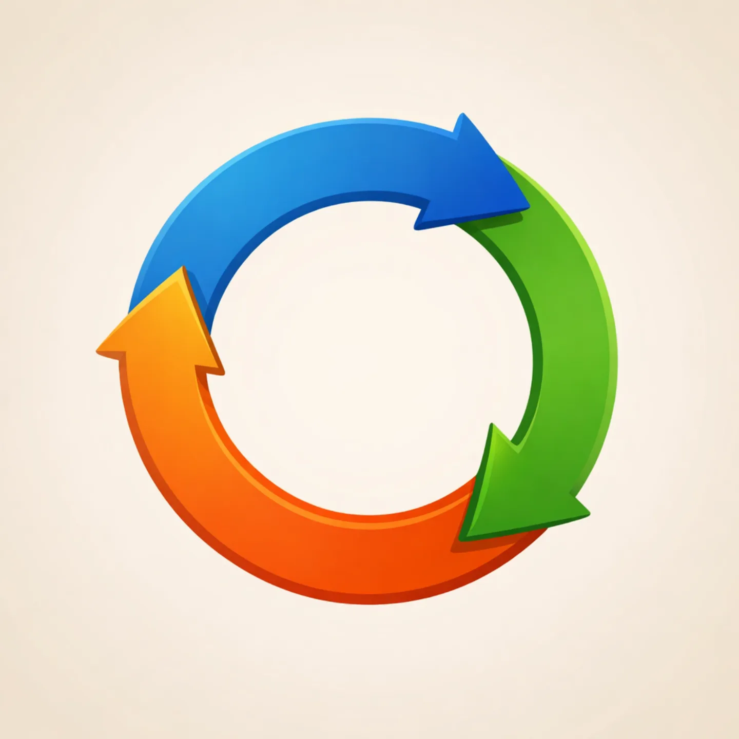
The four jobs of a core loop
Every sticky app has a core loop — the action a user repeats each session. A good one does four things: it's completable in 2–5 minutes (micro-session compatible), it gives immediate feedback, it ends with a variable reward, and it sets up the next session through an open loop.
End on an open loop
The best core loops don't end clean — they end with a Zeigarnik open loop, a setup condition for the next session. An unfinished lesson, a half-built streak, a 'come back tomorrow' hook leaves a small itch the brain wants to close.
Notifications: trigger on state, not the clock
Effective notifications are contextually triggered, not time-scheduled — fire when the user breaks their streak pattern, not at 9 AM daily. They're personalized to state ('Your 14-day streak is at risk' beats 'Don't forget to practice'), and social wherever possible ('Alex just passed your score').

The streak + freeze pattern
Any app usable daily should have a streak counter. The freeze mechanic — letting a missed day pass without losing the streak, purchased or earned — converts the streak from attrition-driving anxiety into a resource-management meta-game that deepens investment.
The 400ms Ceiling
A core loop needs to deliver feedback in under roughly 400 milliseconds — the Doherty Threshold below which an interaction feels immediate and responsive, rather than sluggish.

Instrument the Aha Moment
The Aha Moment is the action most correlated with 7-day retention in your cohort data. Use product analytics to find it, then orient all of onboarding to deliver users there as fast as possible. Everything before the Aha Moment is overhead.
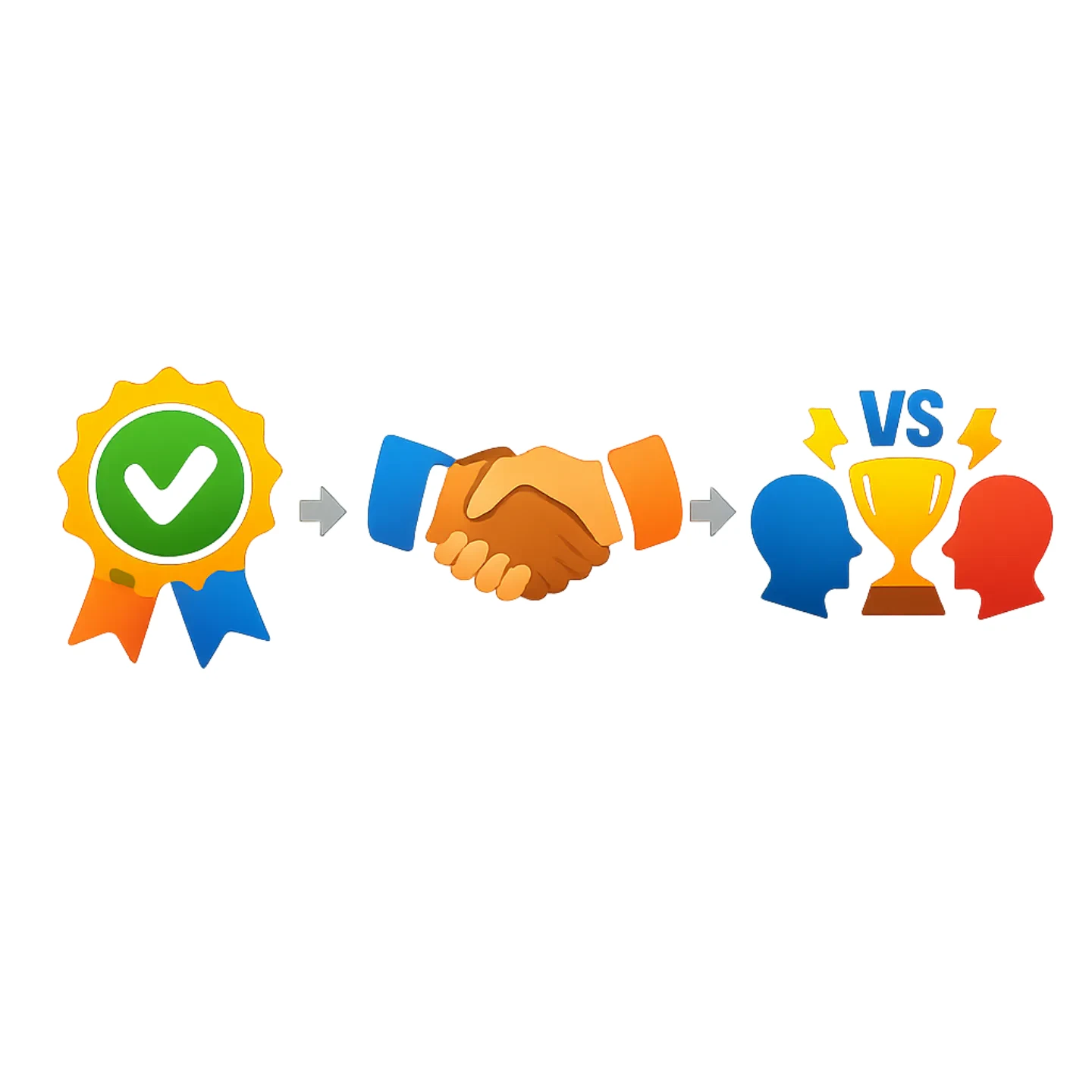
The Social Onboarding Order
Social mechanics should be introduced in sequence: asynchronous social proof first since it needs no mutual timing, cooperative features once the user has a stake, then synchronous competition last, since forcing real-time play too early destroys sessions.
Why Real-Time Waits
Synchronous competition, like live battles or real-time leaderboards, is saved for last in onboarding because forcing real-time play on users who barely know the app destroys more sessions than it creates.
Reveal, Don't Dump
Progressive disclosure means revealing an app's complexity gradually instead of dumping every feature on a new user at once — without context, seeing it all creates overwhelm, not excitement.
Never Start From Empty
The zero blank slate principle pre-populates a new user's experience with suggested friends or seeded content, because an empty screen signals that nobody uses the app.
Same mechanism, opposite intent
The mechanisms that build habits can also build dependencies; the distinction lies in alignment with the user's goals. Dark patterns — shaming copy, impossible cancellation, manufactured scarcity — destroy trust. Humane design uses streak freezes, gentle session-end cues, transparency, and user controls instead.
Impossible To Cancel
An impossible-to-find cancellation flow is a classic dark pattern rather than a humane design choice — it destroys the user's trust in the app.

What People Already Want
Fogg's first maxim tells designers to help people do what they already want to do — lasting behavior change comes from aligning with existing motivation, not pushing users toward goals they don't hold.
Friction Beats Motivation
Fogg's companion maxim holds that removing friction from a desired action changes behavior more reliably than trying to raise motivation for a reluctant one — simplicity wins.
Guilt-Tripping The Decline Button
A decline button labeled 'No, I don't want to be smart' is shaming copy — a dark pattern that works against the user's own goals and erodes long-term trust.
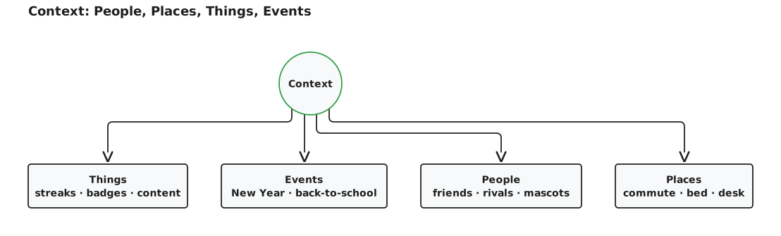
People, Places, Things, Events
Sticky design treats context as a first-class variable across four axes — People (the social graph), Places (where the user engages), Things (artifacts they accumulate), and Events (recurring real-world moments). Each axis is a design question, not an afterthought.
Every 'Thing' is a sunk cost
Under Things, the artifacts a user accumulates — streaks, badges, followers, portfolio items, content — each act as a sunk cost that raises the switching cost of leaving. The more a user has built, the more it hurts to abandon.

Events: the New Year's spike
Events are recurring real-world moments — resolutions, back-to-school, sports seasons, holidays — that open re-engagement windows. Duolingo's record DAU additions in Q1 2025 (more than in any earlier quarter) are plausibly attributable in part to New Year's resolution-makers.
The People Question
The 'People' axis of the PPTE framework asks who is in a user's social graph and how the app surfaces them — building mutual accountability, competitive stakes, and belonging without adding any new content.
Where You Open It
The 'Places' axis asks where a user physically and mentally is when they engage — a commute app should behave differently from a bedtime app, designed for real context rather than one generic session.
By the numbers
- Response time below which core-loop feedback feels immediate (the Doherty Threshold)
- 400 ms
- Upper bound on how long a micro-session-compatible core loop should take to complete
- 5 minutes
- Common rule-of-thumb window for onboarding to deliver the first quick win
- 60 seconds
Matched pairs
Each item on the left goes with the one on the right.
- Personalized notification
- 'Your 14-day streak is at risk'
- Asynchronous social proof
- Leaderboards, follower counts
- Cooperative features
- Shared quests, collaborative challenges
- Synchronous competition
- Live battles, real-time leaderboards
- Fogg's first maxim
- Help people do what they already want to do
- Fogg's maxim on behavior change
- Simplicity changes behavior
- People
- Who is in the user's social graph?
- Places
- Where is the user when they engage?
- Things
- What artifacts does the user accumulate?
- Events
- What recurring real-world moments or occasions re-engage the user?
Step by step
Sequence an app's social features in the right build order
- Asynchronous social proof — leaderboards and follower counts; low friction, immediately reinforcing.
- Cooperative features — shared quests and collaborative challenges; medium investment, once the user has a stake in the product.
- Synchronous competition — live battles and real-time leaderboards; high friction, high reward, best for power users.
Don't force synchronous features early — a user who can't find a match or partner abandons.
Engineer onboarding to deliver every new user to the Aha Moment
- Pull cohort data on users who stuck around long-term versus those who churned.
- Find the early actions that correlate with long-term retention.
- Define the Aha Moment as that exact action sequence (e.g. 7 friends in 10 days).
- Re-engineer onboarding so every new user is driven to that action as fast as possible.
- Confirm the value is felt emotionally, not just that a tutorial was completed.
Teams find the Aha Moment by analysis, not intuition — then build the funnel backward from it.
Self-test
Answer each question from memory, then check your work against the answer key.
1. Why must a core loop deliver feedback in under ~400ms?
- AIt matches the average human blink duration
- BIt is the time a typical user needs to read an on-screen prompt before tapping
- CIt is the delay that makes a variable reward feel most exciting
- DBelow the Doherty Threshold the interaction feels immediate and responsive
2. Which is NOT one of the four jobs a well-designed core loop must do?
- AEnd with a variable reward
- BRequire an in-app purchase to complete
- CSet up the next session via an open loop
- DComplete in 2–5 minutes
3. The Doherty Threshold — below which a user and system keep pace and productivity soars — is what response time?
- A100 ms
- B250 ms
- C400 ms
- D1000 ms
4. To fit a micro-session, how long should a core loop take to complete?
- A2–5 minutes
- B10–15 minutes
- C20–30 minutes
- D30–60 seconds
5. A core loop that ends with a 'come back tomorrow for your result' hook is applying which principle?
- AProgressive disclosure
- BDoherty Threshold
- CZeigarnik open loop
- DZero blank slate
6. Why is firing a notification at 9 AM every day, regardless of user state, the weakest signal?
- AIt closes the Zeigarnik open loop before the user feels a pull to return
- BThe brain habituates to a predictable signal and starts ignoring it
- CIt skips the variable reward that keeps anticipation high
- DIt triggers loss aversion before the streak feels earned
7. Which notification best references a user's specific investment in the app?
- AYour 14-day streak is at risk
- BPractice makes perfect!
- CNew features are now available
- DDon't forget to practice today
8. An effective notification should fire when the user…
- AHas been inactive for precisely 24 hours
- BInstalls a competing app
- CReaches exactly 9 AM local time
- DBreaks their streak pattern or crosses a meaningful threshold
9. A notification reading 'Alex just passed your score' layers in which additional force?
- AProgressive disclosure
- BThe Doherty Threshold
- CCompetitive loss aversion
- DManufactured scarcity
10. Rank these notification strategies from weakest to strongest signal.
- AFixed daily clock alert → personalized streak alert → social 'a friend passed you' trigger
- BSocial 'a friend passed you' trigger → personalized streak alert → fixed daily clock alert
- CFixed daily clock alert → social 'a friend passed you' trigger → personalized streak alert
- DPersonalized streak alert → fixed daily clock alert → social 'a friend passed you' trigger
11. In the recommended social onboarding sequence, why does synchronous competition (live battles, real-time leaderboards) belong last?
- AReal-time features are the most expensive to build, so they ship last
- BForcing real-time multiplayer on users who barely know the app destroys more sessions than it creates
- CSynchronous features require push permissions that new users rarely grant
- DLive competition only works once an app has millions of users for matchmaking
12. What is the correct order for introducing social mechanics in onboarding?
- AAsynchronous social proof → synchronous competition → cooperative features
- BSynchronous competition → cooperative features → asynchronous social proof
- CCooperative features → asynchronous social proof → synchronous competition
- DAsynchronous social proof → cooperative features → synchronous competition
13. What does progressive disclosure mean as an onboarding principle?
- ADelaying all features until the user pays
- BRevealing complexity gradually rather than dumping every feature at once
- CPre-filling the screen with seeded example content
- DShowing every feature upfront so users learn all capabilities
14. The zero blank slate principle exists to solve which problem?
- AReal-time matchmaking needs many users
- BNotifications habituate over time
- CAn empty screen signals that the app is worthless
- DUsers forget which features exist
15. Which is NOT a form of asynchronous social proof?
- AA live real-time battle against a matched opponent
- BA visible activity feed
- CA follower count
- DA leaderboard
16. Which is a dark pattern rather than a humane design choice?
- AUser controls over notification frequency
- BA gentle session-end cue
- CA streak freeze that absorbs a missed day
- DAn impossible-to-find cancellation flow
17. What does Fogg's first maxim tell designers to do?
- AAdd friction to keep users from leaving
- BIncrease motivation for goals users don't hold
- CHelp people do what they already want to do
- DManufacture new wants users didn't have
18. Per Fogg's companion maxim, what changes behavior more reliably than raising motivation?
- ASending more frequent reminders
- BRemoving friction from a desired action (simplicity)
- CApplying social pressure
- DAdding more variable rewards
19. Which trio are the practical humane outputs of designing from Fogg's maxims?
- AFixed 9 AM pushes, variable rewards, and open loops
- BInfinite scroll, autoplay, and streak-loss anxiety
- CManufactured scarcity, shaming copy, and hard-to-find cancellation
- DStreak freezes, gentle session-end cues, and notification-frequency controls
20. A decline button labeled 'No, I don't want to be smart' is an example of what?
- AShaming copy, a dark pattern
- BA Zeigarnik open loop
- CProgressive disclosure
- DFogg's first maxim
21. In the PPTE framework, which axis covers accumulated artifacts like streaks, badges, and followers?
- APeople
- BEvents
- CPlaces
- DThings
22. The PPTE context framework stands for which four axes?
- APlaces, People, Tools, Emotions
- BPeople, Places, Things, Events
- CPersonas, Places, Triggers, Events
- DPeople, Products, Time, Engagement
23. In PPTE, the 'People' axis asks which question?
- AWhat artifacts does the user accumulate?
- BWhat recurring real-world moments re-engage the user?
- CWho is in the user's social graph, and how does the app surface them?
- DWhere is the user when they engage?
24. The 'Places' axis of PPTE is concerned with…
- AWhere the user is (physical and cognitive context) when they engage
- BHolidays and seasonal spikes
- CBadges and streaks the user has earned
- DWho is in the user's social graph
25. Duolingo added more daily active users in Q1 2025 than in any earlier quarter. Which Events lever is plausibly part of the reason?
- AA major redesign of the lesson interface
- BThe launch of a new subscription tier
- CA viral referral marketing campaign
- DNew Year's resolution-makers picking up language learning
Go deeper
- ReadHooked by Nir Eyal, Ryan Hoover · on Amazon ↗
- StudyThe Science of Sticky Apps in the FlashFeed app
These are affiliate links: if you buy a book through one, FlashFeed may earn a small commission at no extra cost to you. The commission helps pay for FlashFeed's servers.
As an Amazon Associate we earn from qualifying purchases.
Answer key
- 1. D Below the Doherty Threshold the interaction feels immediate and responsiveThe Doherty Threshold is the ~400ms ceiling below which feedback feels immediate; cross it and responsiveness — and engagement — drops off.
- 2. B Require an in-app purchase to completeThe four jobs are: completes in 2–5 min, gives feedback under the Doherty Threshold, ends with a variable reward, and sets up the next session. Requiring a purchase is not one of them.
- 3. C 400 msDoherty and Thadhani (IBM, 1982) found that responses under 400 ms keep users and systems from waiting on each other, so productivity soars.
- 4. A 2–5 minutesA micro-session-compatible loop completes in 2–5 minutes, fitting between meetings or on a commute.
- 5. C Zeigarnik open loopAn open-loop hook leaves an unfinished task that users tend to want to resume (the Ovsiankina tendency, popularly credited to the Zeigarnik effect, whose memory advantage has proved hard to replicate). That pull is why the user returns to close the loop.
- 6. B The brain habituates to a predictable signal and starts ignoring itA fixed clock-based signal is predictable, so the brain habituates and tunes it out over time. State-triggered notifications stay meaningful.
- 7. A Your 14-day streak is at riskA personalized notification citing the user's own streak outperforms a generic reminder because it references their specific investment.
- 8. D Breaks their streak pattern or crosses a meaningful thresholdContextually triggered notifications fire on behaviorally meaningful state changes — like breaking a streak pattern — not on the clock.
- 9. C Competitive loss aversionSocial triggers add competitive loss aversion on top of a personalized state signal, giving the user a rival-driven reason to return.
- 10. A Fixed daily clock alert → personalized streak alert → social 'a friend passed you' triggerIn this ranking, a fixed clock signal is the weakest (the brain habituates), a personalized state alert outperforms a generic reminder, and a social trigger layers competitive loss aversion on top of that, so it ranks strongest.
- 11. B Forcing real-time multiplayer on users who barely know the app destroys more sessions than it createsThe sequence follows where trust sits: asynchronous social proof first (no mutual timing needed), then cooperative features, then synchronous competition last — forcing real-time play on users who barely know the app destroys more sessions than it creates.
- 12. D Asynchronous social proof → cooperative features → synchronous competitionAsync social proof needs no mutual timing so it comes first; cooperation once the user has a stake; synchronous competition last, since forcing real-time play too early destroys sessions.
- 13. B Revealing complexity gradually rather than dumping every feature at onceProgressive disclosure reveals complexity gradually; new users lack context to evaluate unseen features, so showing all at once creates overwhelm, not excitement.
- 14. C An empty screen signals that the app is worthlessZero blank slate pre-populates a new user's experience with suggested friends or seeded content, because an empty screen communicates that nobody uses the app.
- 15. A A live real-time battle against a matched opponentAsync social proof (leaderboards, follower counts, activity feeds) needs no mutual timing. A live real-time battle is synchronous competition, which belongs last.
- 16. D An impossible-to-find cancellation flowImpossible cancellation is a classic dark pattern that destroys trust. Freezes, session-end cues, and notification controls are humane alternatives.
- 17. C Help people do what they already want to doFogg's first maxim — help people do what they already want to do — holds that lasting behavior change requires motivation alignment, not pushing users toward goals they don't hold.
- 18. B Removing friction from a desired action (simplicity)Fogg's maxim 'simplicity changes behavior' says removing friction from a desired action beats trying to increase motivation for a reluctant one.
- 19. D Streak freezes, gentle session-end cues, and notification-frequency controlsFogg's maxims yield humane tools: streak freezes, gentle session-end cues, and user controls over notification frequency. The other trios are dark patterns or clock-based nags.
- 20. A Shaming copy, a dark patternGuilt-inducing decline labels are shaming copy — a dark pattern that works against the user's goals and erodes long-term trust.
- 21. D ThingsThings are the artifacts a user accumulates; each one is a sunk cost that raises the switching cost of leaving.
- 22. B People, Places, Things, EventsPPTE organizes contextual design levers into People, Places, Things, and Events — each a distinct design question, not an afterthought.
- 23. C Who is in the user's social graph, and how does the app surface them?People concerns the social graph — creating mutual accountability, competitive stakes, and belonging without any new content.
- 24. A Where the user is (physical and cognitive context) when they engagePlaces asks where the user engages; a commute app behaves differently from a bedtime app, so design for the actual context of use, not a generic session.
- 25. D New Year's resolution-makers picking up language learningEvents are recurring cultural moments that open re-engagement windows; New Year's resolution-makers plausibly explain part of Duolingo's record Q1 2025 DAU additions.
Image credits
- The four jobs of a core loop: AI-generated (gpt-image-1.5)
- The streak + freeze pattern: Don Komarechka (Openverse) · cc0 1.0 — www.flickr.com/photos/35693660@N03/38115232341
- Instrument the Aha Moment: AI-generated (gpt-image-1.5)
- The Social Onboarding Order: AI-generated (gpt-image-1.5)
- What People Already Want: Wikimedia Commons · Wikiwisesw · CC BY-SA 4.0 — commons.wikimedia.org/wiki/File:2017_portrait_BJ_Fogg.jpg
- People, Places, Things, Events: FlashFeed original diagram · CC-BY-4.0
- Events: the New Year's spike: Wikimedia Commons · Porto Bay Hotels & Resorts · CC BY 2.0 — commons.wikimedia.org/wiki/File:Rio_New_Year_Fireworks.jpg

